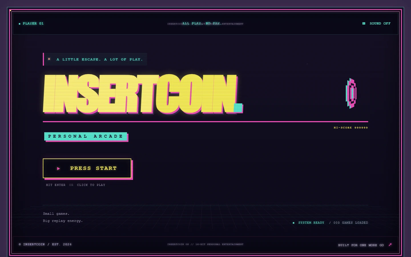
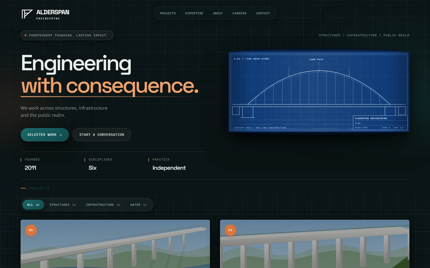
Hand-and-croissant mark
The logo is a custom SVG component — an open hand offering a croissant — used at every scale from the favicon to the header lockup and the footer.
A self-directed bakery concept built around a hand-and-croissant mark, drawn pastry illustrations, and a warm editorial menu.
Overview
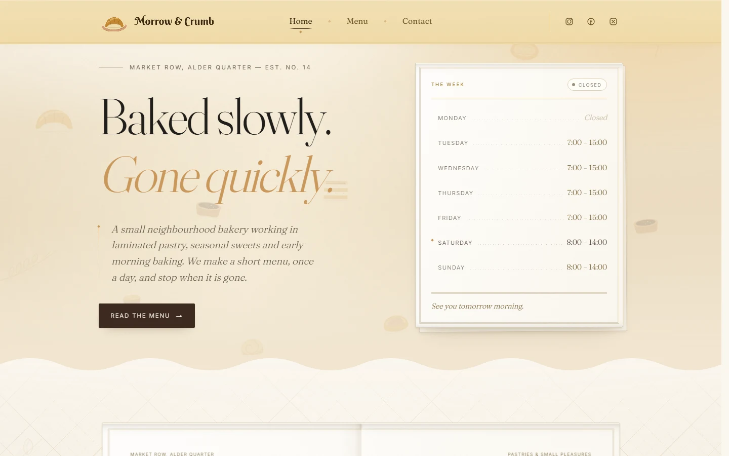
Morrow & Crumb is an independent concept project. The bakery, its address, hours, menu, and contact details are all invented for the purpose of the design.
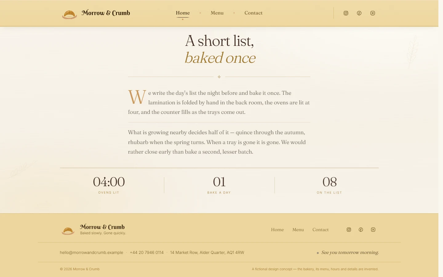
It is deliberately a small static site — one page, three sections — which put the weight on identity, illustration, and typography rather than on structure. Everything is hand-written CSS with no UI framework.
From the site
Notable details
The logo is a custom SVG component — an open hand offering a croissant — used at every scale from the favicon to the header lockup and the footer.
A dedicated animation hook runs the opening logo sequence and flips a single revealed flag on the page, which the header and hero read to settle into their resting state. Timing lives in one place and is easy to retune.
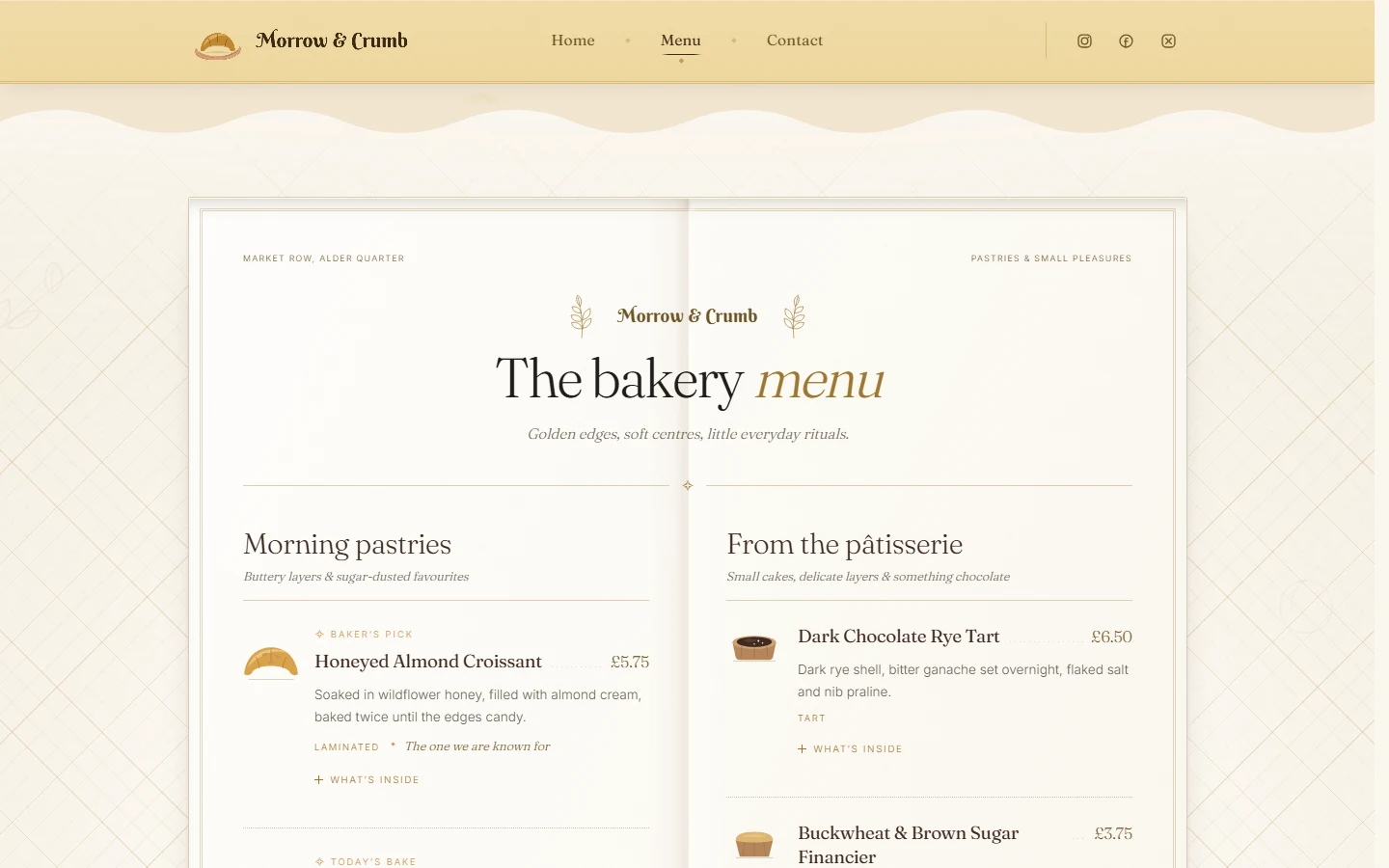
Every menu item has its own vector illustration rather than a stock photograph, which keeps the palette consistent and the page light.
A honey and cream palette, a display serif paired with a quiet sans, a torn wave dividing hero from menu, and drifting background shapes give the page its character without decoration for its own sake.
Items, prices, categories, and notes live in one typed file, so the menu can be reordered or reseasoned without touching layout code.
The two-column hero, the menu grid, and the footer collapse cleanly down to phone widths, and the whole thing builds to static files.
See it running
The deployed version of Morrow & Crumb is live — open it in a new tab.